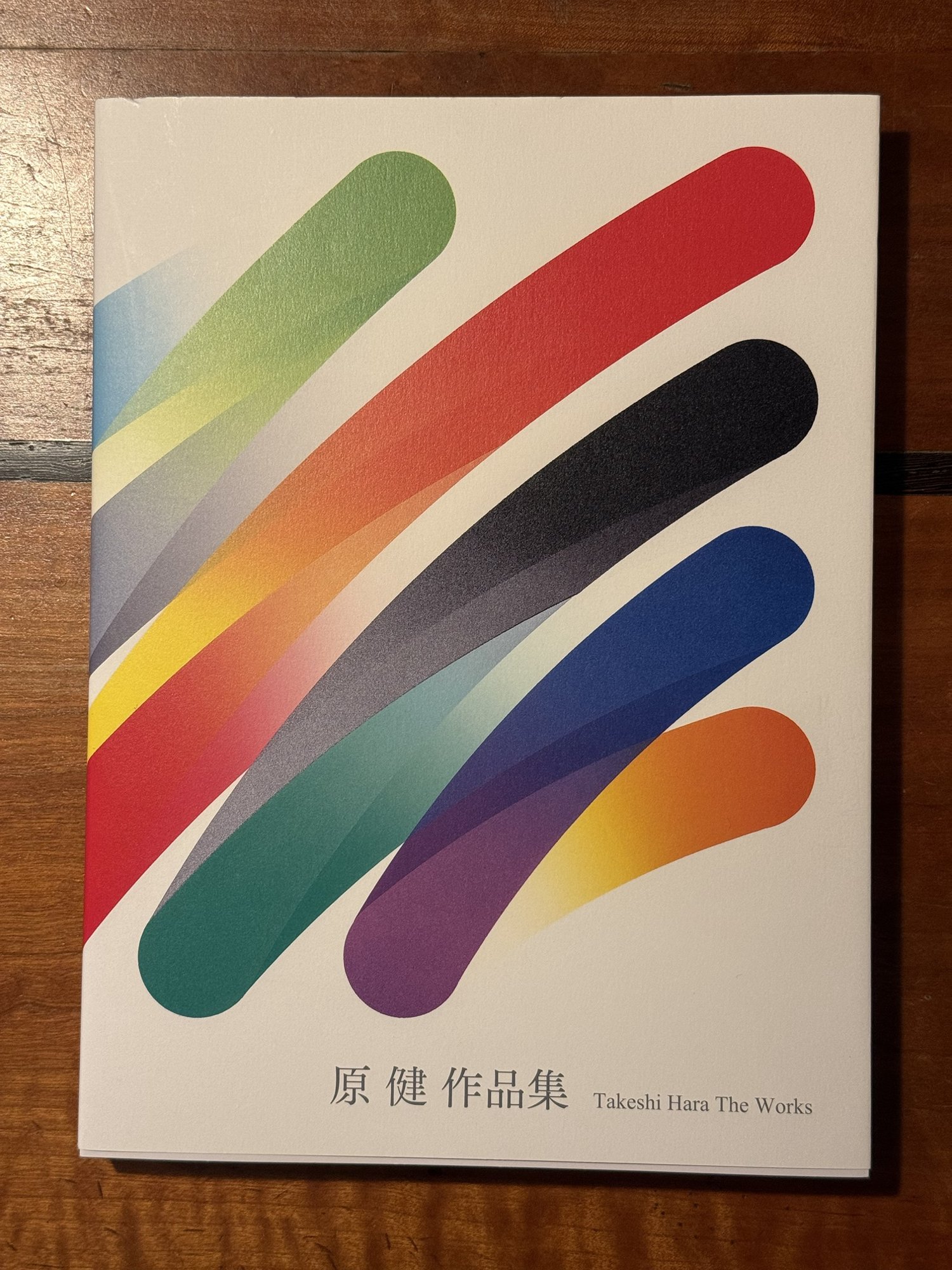
原健 作品集 (Takeshi Hara: The Works)
- Author
- Takeshi Hara
- Year
- 2026
- Publisher
- Abe Publishing (阿部出版)
- ISBN
- 978-4-87242-542-0
- Subject
- Takeshi Hara
- Tags
- physical · japan · takeshi hara · printmaking · catalogue raisonné · lithography · monograph
Notes
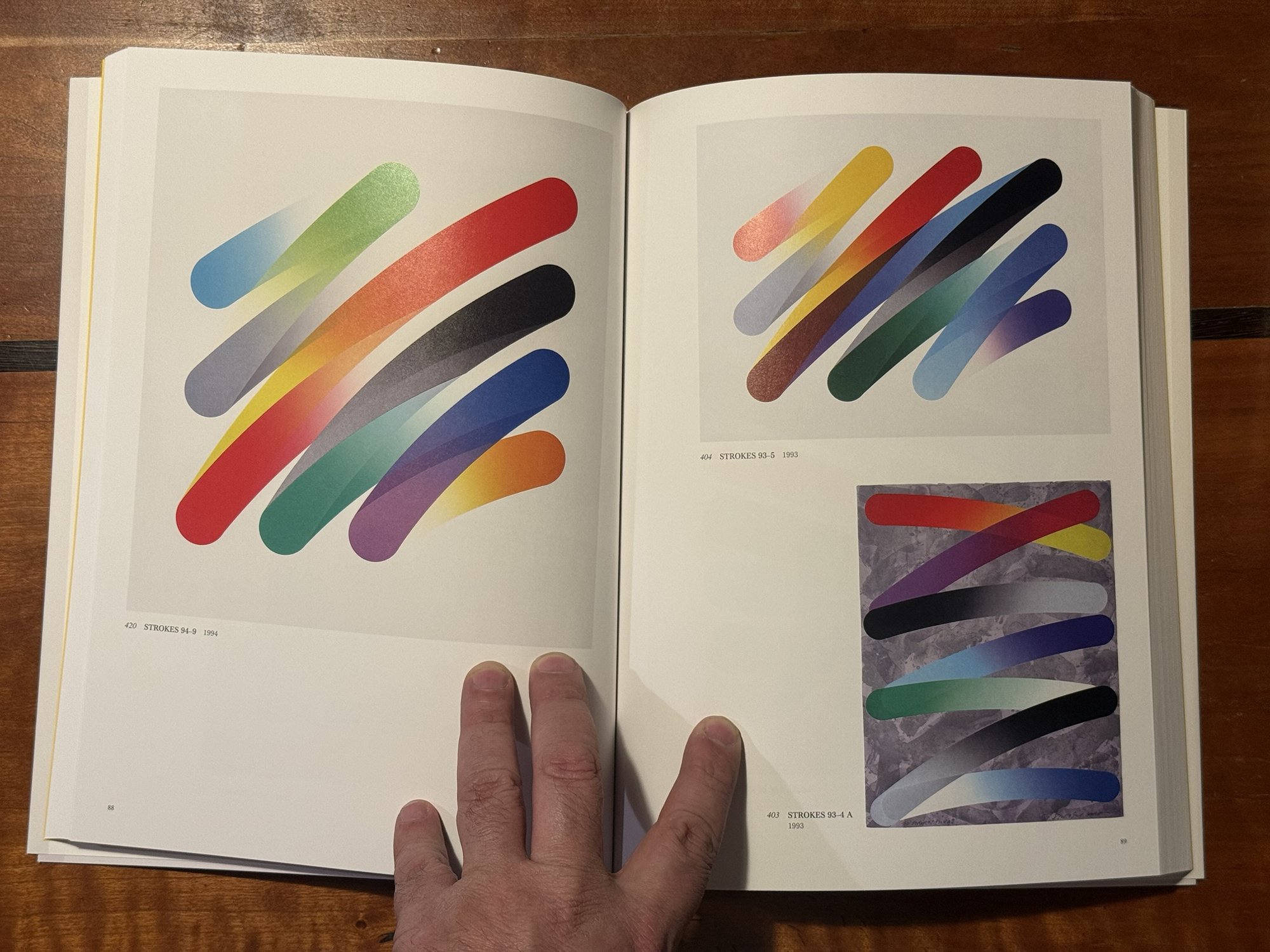
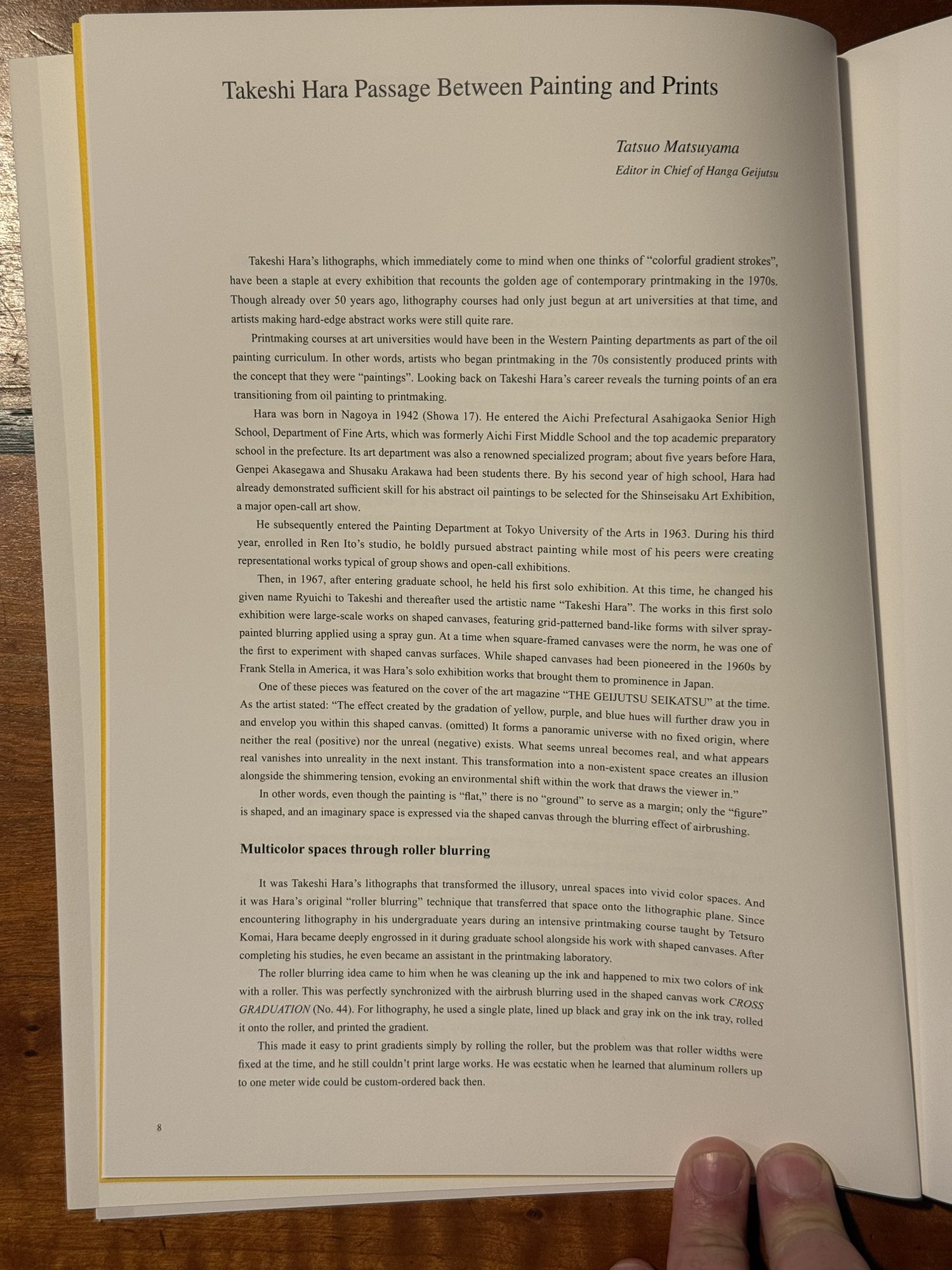
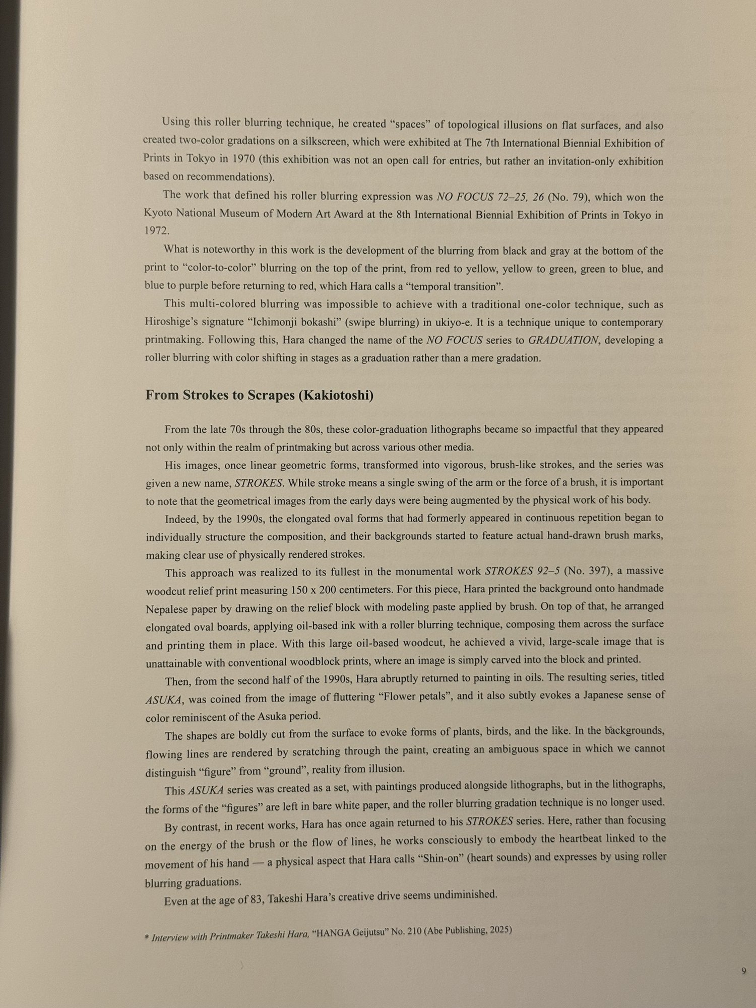
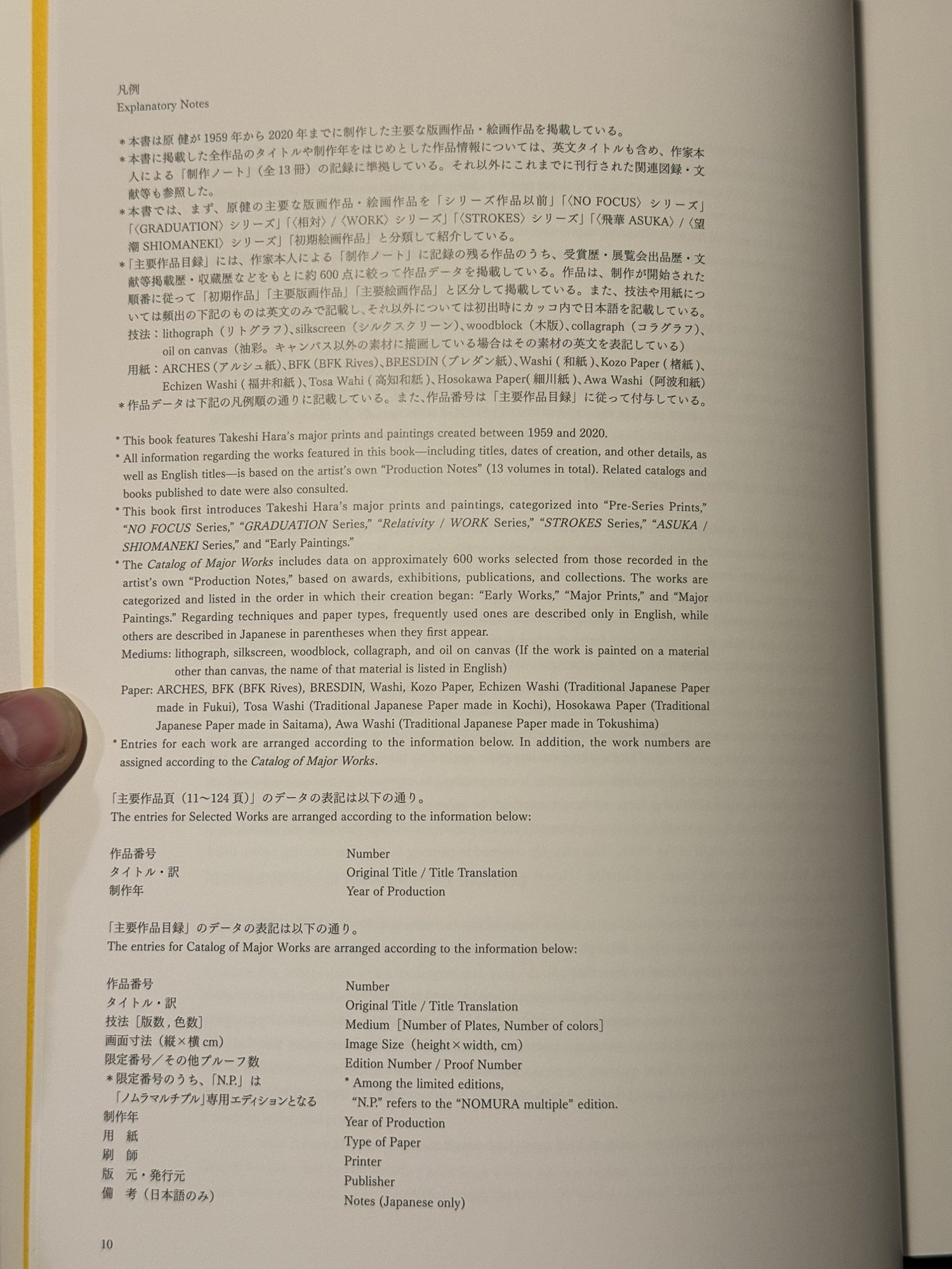
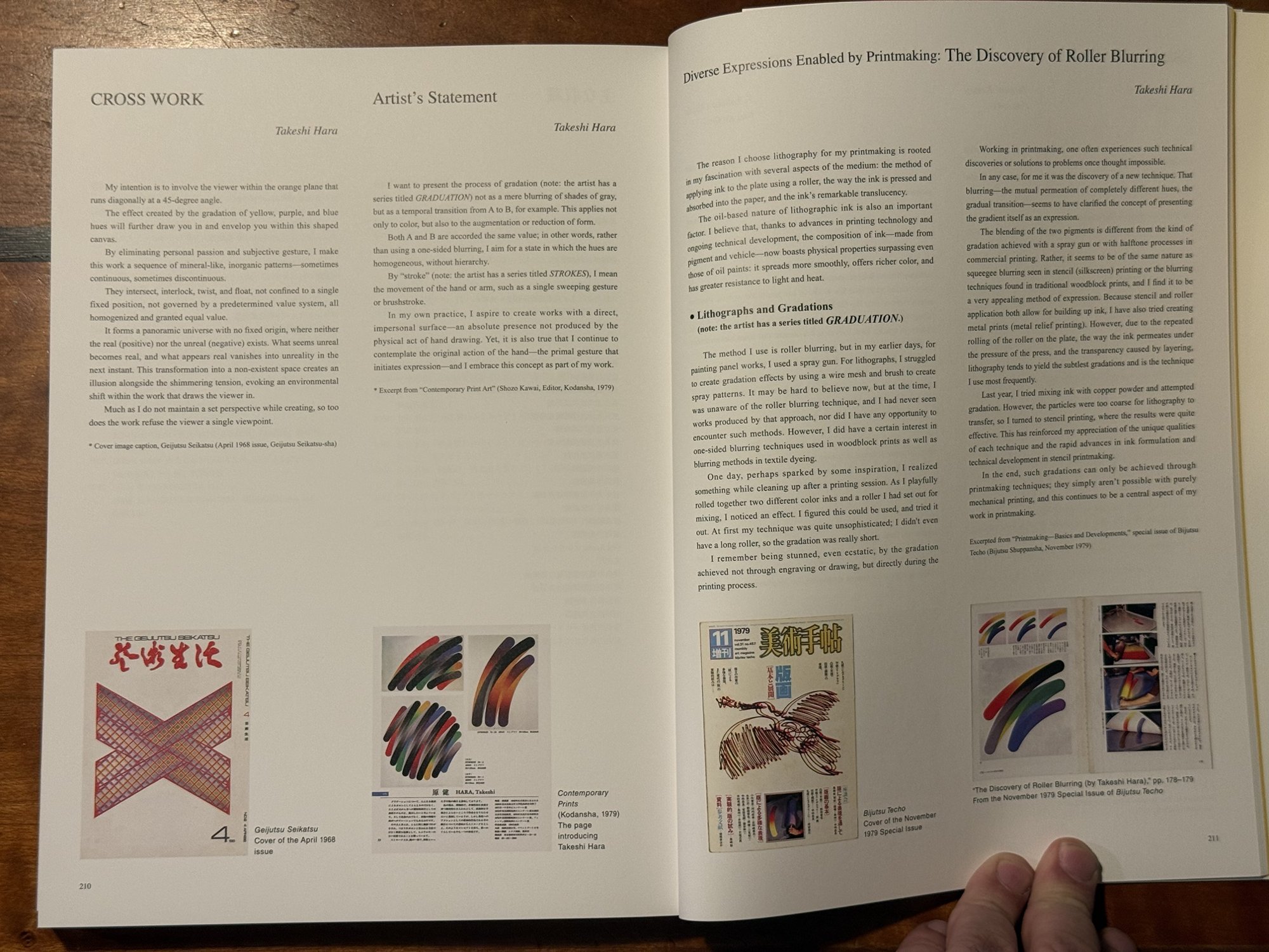
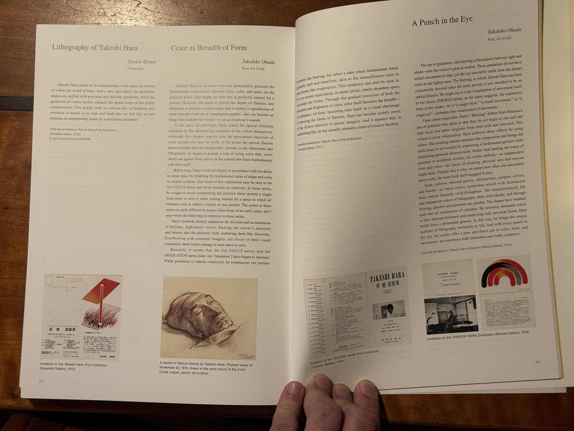
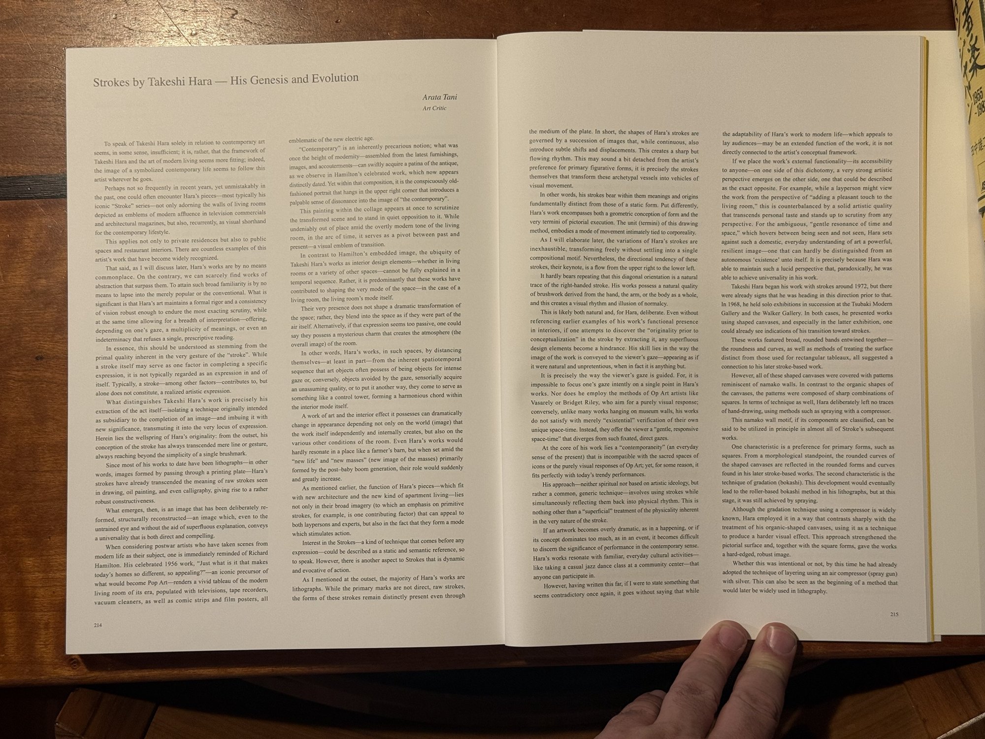
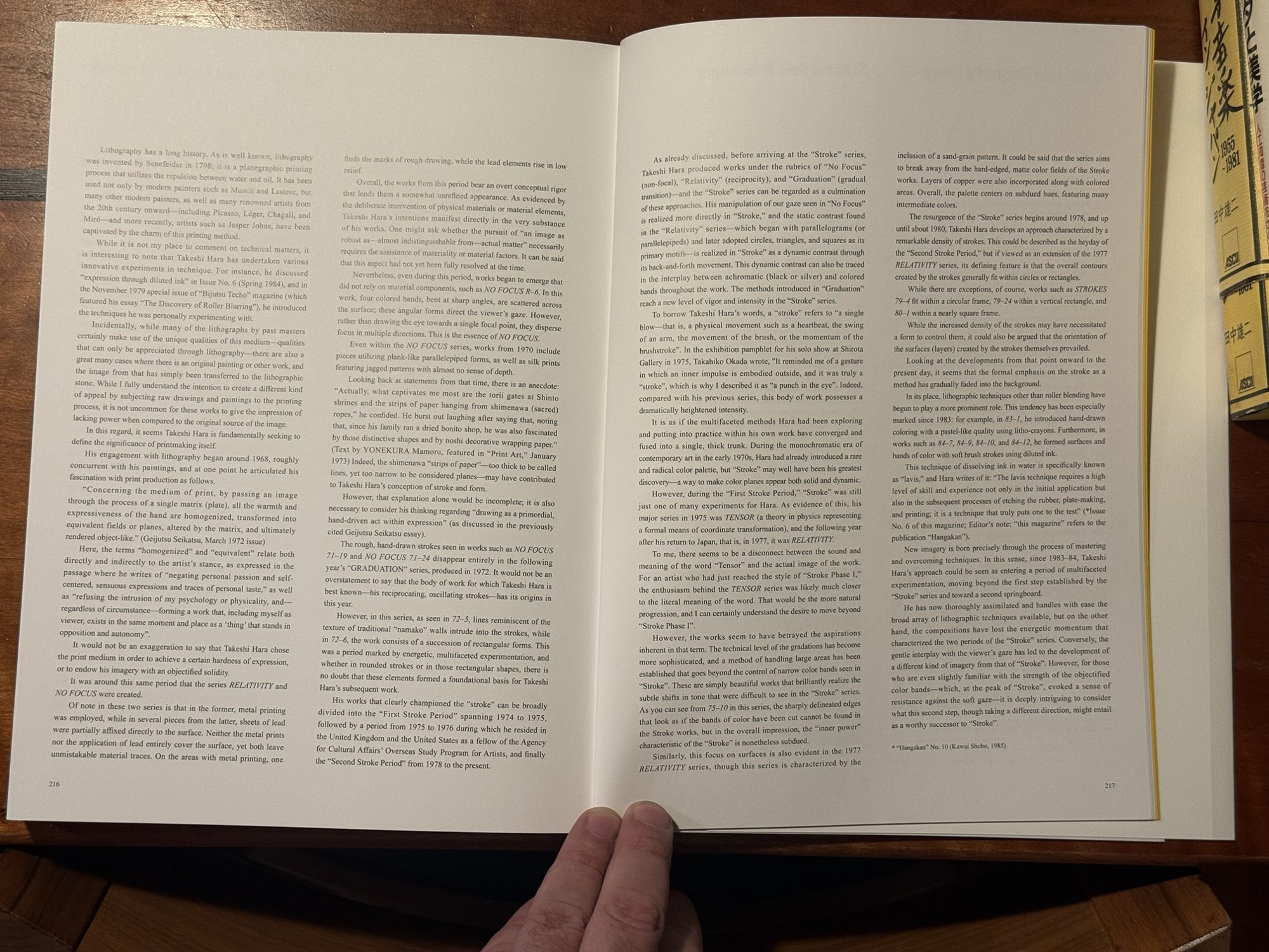
Definitive monograph reproducing more than 600 works: early pieces, the lithograph series NO FOCUS, GRADUATION and STROKES, and the scraped-surface painting series ASUKA from the late 1990s on. Hara arrived in the 1970s with roller-blended colour gradation in lithography, winning prizes at international print exhibitions; he drew on Stella and Vasarely while folding in the ichimonji-bokashi gradient of ukiyo-e woodblock printing. Physical copy in the collection, on order. Bought 2026-10-19 through ZenMarket (womh73) from Amazon Japan: item ¥7,700, ZenMarket commission ¥500. International EMS shipping not yet billed. IN TRANSIT — awaiting the Osaka warehouse and shipment to the USA. A second, new copy was bought by mistake on eBay on 24 October 2026 (order 09-15340-26838, seller ninja_japan_shop, US$140.13 with shipping from Japan); it will be given away as a gift, not kept as a second copy. Received 3 November 2026 and photographed: cover, a STROKES spread, the lead essay, the explanatory notes and the reprinted texts at the back. Abe Publishing (阿部出版), Tokyo, July 2026, about 220 pages, 30 cm, Japanese and English throughout; ISBN 978-4-87242-542-0. The cover is STROKES 94-9 (1994). The book reproduces Hara's major prints and paintings from 1959 to 2020 in series order — pre-series prints, NO FOCUS, GRADUATION, Relativity / WORK, STROKES, ASUKA / SHIOMANEKI (望潮), early paintings — with a Catalog of Major Works of about 600 entries selected from the thirteen volumes of production notes the artist has kept, each giving medium (with plate and colour counts), image size, edition, paper, printer and publisher. The explanatory notes record that "N.P." editions are the Nomura multiple series; the small Hara prints in editions of 500 in this collection are probably from it. The lead essay, "Takeshi Hara: Passage Between Painting and Prints" by Tatsuo Matsuyama, editor in chief of Hanga Geijutsu, draws on a 2025 interview (Hanga Geijutsu no. 210). Hara was born in Nagoya in 1942 and went to the fine-art course of Aichi Prefectural Asahigaoka High School, where Genpei Akasegawa and Shūsaku Arakawa had been pupils a few years earlier; an abstract oil of his was accepted by the Shinseisaku exhibition while he was still at school. He entered the painting department of Tokyo University of the Arts in 1963, studied in Ren Itō's studio, and in 1967, on entering the graduate course, held his first solo show and changed his given name from Ryūichi to Takeshi. The show was of large shaped canvases: grids of bands sprayed with silver gradations through an airbrush, among the first shaped canvases in Japan after Stella's; one was the cover of Geijutsu Seikatsu in April 1968. Tetsurō Komai's intensive printmaking course had introduced him to lithography, and after graduate school he became an assistant in the printmaking laboratory. Roller blurring came to him while cleaning up ink: two colours happened to mix on one roller, which matched the airbrush blurring of his shaped canvas CROSS GRADUATION. He lined black and grey ink up on the tray, rolled it onto the roller and printed the gradient from a single plate; aluminium rollers a metre wide, made to order, let him print large. Two-colour silkscreen gradations went to the 7th Tokyo International Print Biennale in 1970, and NO FOCUS 72-25, 26 (no. 79) won the National Museum of Modern Art, Kyoto award at the 8th Biennale in 1972, its blurring running black-and-grey at the bottom to colour-to-colour at the top — red to yellow to green to blue to violet and back to red, which Hara calls a "temporal transition" and which single-colour ichimonji-bokashi could never do. He renamed the series GRADUATION: colour shifting in stages, a graduation rather than a gradation. From the late 1970s the geometric bands became brush-like STROKES, the stroke being a single swing of the arm; by the 1990s the ovals structured compositions individually over hand-brushed grounds, culminating in STROKES 92-5 (no. 397), a 150 × 200 cm oil-based woodcut on Nepalese paper with roller-blurred oval boards printed in place. From the later 1990s he returned to oils with ASUKA (飛華, "fluttering petals", with an echo of Asuka-period colour): plant and bird shapes scraped out of the paint (kakiotoshi), the lithograph versions leaving the figures as bare white paper. His recent STROKES aim at the heartbeat behind the hand's movement, which he calls shin-on, heart sounds. He was 83 when the essay was written. The back matter reprints the artist's own texts: "Cross Work", his caption for the 1968 Geijutsu Seikatsu cover (an orange plane at 45 degrees whose gradations draw the viewer into a space with no fixed origin, "so too does the work refuse the viewer a single viewpoint"); a statement from Contemporary Print Art (Shōzō Kawai, ed., Kodansha, 1979) on presenting gradation as a temporal transition from A to B in which both are accorded equal value, and on the stroke as the primal gesture of the hand; and "The Discovery of Roller Blurring" from the November 1979 printmaking special issue of Bijutsu Techō, on why lithography — the roller, the ink pressed into the paper, its translucency — and the day he "playfully rolled together two different color inks" and was "stunned, even ecstatic" at a gradation achieved in the printing itself. Then three early critics' texts from exhibition invitations: Tetsurō Komai (Garandō Gallery, 1972), who hears in the prints "contemporary music by a perceptive composer"; Takahiko Okada's "Color as Breadth of Form" (Yoseido Gallery, 1973), on NO FOCUS and Relativity as fields with no single focal point, where colour itself becomes form's breadth, "time itself, as a visual afterimage"; and Okada's "A Punch in the Eye" (Shirota Gallery, 1974), on blurring that begins at both ends of a band and meets in the middle, so that the strokes become "traces of pleasing, physical acts that anyone might share". Hara's conté sketch of Komai, drawn in the early hours of 21 November 1976 after his teacher's death, is reproduced beside them. Arata Tani's long essay "Strokes by Takeshi Hara: His Genesis and Evolution" (written for Hangakan no. 10, Kawai Shobō, 1985) reads the strokes against modern living — their ubiquity in television commercials and architectural magazines, by way of Richard Hamilton's 1956 collage — and argues that Hara isolated the stroke, a technique usually subsidiary to an image, and made it the locus of expression, with a diagonal from upper right to lower left as the natural trace of the right hand. Tani dates the first stroke works to about 1972 and traces the shaped canvases of 1968 (two solo shows at Tsubaki Modern Gallery and the Walker Gallery, namako-wall patterns, compressor-sprayed silver) as their origin; quotes Hara's 1972 Geijutsu Seikatsu statement on the print matrix "homogenizing" the hand's warmth into something "object-like"; records the lead sheets and metal printing of NO FOCUS and RELATIVITY, and Hara's confession to Mamoru Yonekura (Print Art, January 1973) that torii gates, shimenawa ropes and noshi wrapping paper captivated him more than anything, his family having run a dried-bonito shop; and divides the series into a first stroke period (1974–75), the 1975–76 fellowship in Britain and America, and a second from 1978, with TENSOR (1975) and RELATIVITY (1977) between. From 1983 Hara took up litho-crayon and lavis — ink dissolved in water, "a technique that truly puts one to the test" — in works such as 83-1 and 84-7 to 84-12, which Tani saw as a second springboard after STROKES. In this collection the monograph is the reference for the Hara prints bought in October 2026 (STROKES 74-3, 78-4, 82-15, 87-7 and 89-16 among them, plus RHAPSODY 47, the 1973 Geidai calendar etching and the 21st-Century Prints offsets) and for the 2008 catalogue STROKES / ASUKA: Works 1965–2008.